
 The managing partner, that is myself Moira Ashleigh, often has a say in questions for the interviews on Corvid design, but the art director usually leads the interviews. This time the questions came only from the managing partner to the art director, Duncan Eagleson.
Simpler questions with more complex answers. Enjoy!
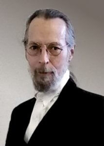
Duncan Eagleson, Corvid Design’s art director is a true renaissance man. Writer, painter, sculptor and maskmaker… Joseph Campbell once said that the best predictor of an artistic career was the number of different jobs held before age 30, and Duncan is living proof of that. In his youth, he pursued a variety of careers, including advertising copywriter, trade show director, actor, stage fight choreographer, private detective, astrologer and card reader, among others. By age 30, he had turned finally to art and writing, producing illustrations for magazines, book covers, film and theater posters, and comics. In the 1980s, he was producing movie posters like Nightmare on Elm Street and Blademaster, theatrical billboards for the Pittsburgh Public Theatre, Lamb’s Theatre, and internationally reknowned magician Jeff McBride. The Who, Phil Collins, Eric Clapton, Def Leppard, and many other rock groups have used his designs on their tour T-Shirts. His paintings and cover designs graced science fiction and horror paperbacks by authors like Fred Saberhagen, Graham Masterton, Les Daniels, and Robert E. Howard. Comics fans may know him from his popular graphic novel adaptation of Anne Rice’s The Witching Hour, Neil Gaiman‘s Sandman, Shade the Changing Man, and the Paradox Press “Big Books” series.
He is also a leather maskmaker, a sculptor, and a writer. His short stories have appeared in several anthologies, and his first novel, Darkwalker, was highly praised by fantasy maven Charles de Lint.
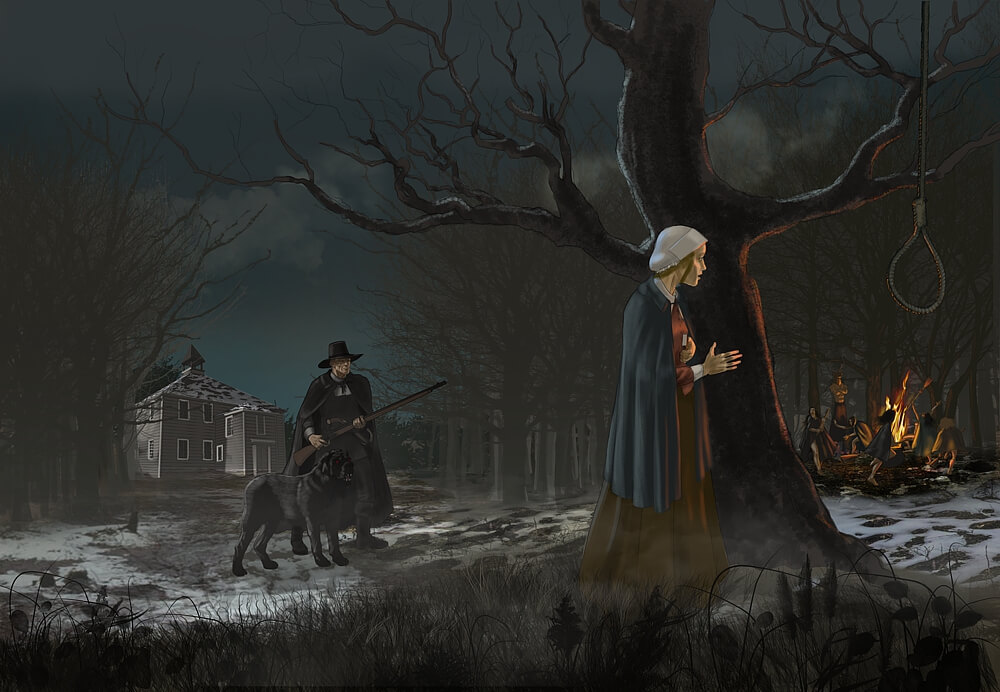
Corvid Design: Over the last few weeks, you posted a number of black and white images with the tag “Inktober.” So, tell us about the Inktober project.
Duncan Eagleson: Inktober was started by an artist named Jake Parker in 2009. His original idea was to improve his ink drawing skills by doing one drawing every day during the month of October. Other artists liked the idea and joined in, and now hundreds (for all I know, thousands) of artists participate.
 I learned about it late – it was halfway through this October when I stumbled across Inktober pieces by a couple of artists I know. I’d been thinking for a while I needed to do something along these lines to help hone my skills, particularly my digital painting skills. The last time I did something like this, it was a painting a day for a month, and I gessoed over the painting the following day to begin a new one. It was a process that lead to major advances in my skills. So, looking at the Inktober thing, I adapted it to my own purposes, and sort of met it half way by doing black and white paintings in Photoshop. My schedule was such that I didn’t have time for one a day, but I managed one every other day for the latter half of the month. To add to the challenge, I set myself a couple of other rules: minimal layers, no adjustments (like brightness, contrast, etc), and no selections or masks – everything done by hand. When you’ve gotten used to using layer masks, going back to using the eraser again is a little like losing the “undo” option.
Subject-wise, Inktober has no constraints at all, you can draw anything. Although Parker does publish a set of 31 prompts on his website, that’s just a courtesy for those who may be lacking inspiration on a given day. I chose to work with a theme, and did a series of portraits of horror stars – I thought that was appropriate for the season. Since I was working in black and white, it seemed a natural to start with the stars of the old Universal black and white horror movies of the 30s and 40s. That was very much a return to my roots. I think one of my first really serious efforts at drawing as a kid was copying (in colored pencil) a Basil Gogos painting of Bela Lugosi as Dracula.
Being a writer and a movie buff, I couldn’t resist accompanying the pictures with a few comments about the actor and their films.
Editor’s note: You can see more Inktober images by Duncan at to his Deviant Art Gallery.
CD: Was the working strictly in black and white challenging? Or maybe freeing, in a way?
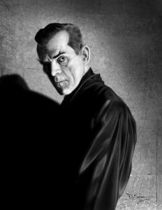
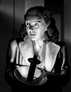 DE: Definitely both. You’re not having to think about color, just composition and tone, contrast. Of course, in several cases, I just went with the original Hollywood photographer’s composition, those still photographers of the day really knew what they were doing. So they’re really just studies in values, in using pure value to make a visual statement. The mass of Karloff’s shadow and black silk shirt, or the way the light source works from Evelyn Ankers’ candle (it looks all right at first glance, but look close, you’ll see evidence the effect is a photographer’s lighting trick – I specifically did not correct that, but rendered it as it was).
Some people might look at these pieces and say, “But you’re just copying photographs.” Well, yeah, that’s exactly right. I’m not putting these things out as vastly original creations, they’re exercises, studies, just like going to a museum and copying an old master painting (which I’ve also done) – except these are old master photographs. The central problem was how to reproduce these effects in digital paint. I feel like I learned a lot doing them.
CD: You’ve worked on book covers for the majors, and for small presses, you’ve created movie posters and theater ads, comics and graphic novels, sculptures, masks, and more. What’s your favorite form of visual art?
 DE: I don’t know that I have a favorite form, but I guess if you put a gun to my head and forced me to pick, I’d have to say painting, whether digital or traditional. But even the visual arts are not just about the visual for me. My art is about telling stories with words and images, whether it’s a comics story, a book cover, a movie poster or DVD cover. Those covers tell a story as well, they’re telling a story about what’s inside. There was a time, back in the early eighties, when I took some of my paintings around to New York galleries, and they all turned up their noses at it, usually sneering something about “narrative art” and “representationalism.” One fellow actually said “This isn’t ‘Art,’ it’s merely illustration.” Well, duh… yes, it is, and I’m not embarrassed by that, I’m proud of it. I don’t accept the assertion, which was common in those days, that illustration cannot, by definition, be “art” with a capital “A.” That’s nonsense. Storytelling is one of the most basic and essential of human activities, and informs all types of art, high and low, whether the artist intends a “narrative” or not.
CD: As an artist, you’re mostly known for your book covers and comics work. What was your first book cover, and your first comic?
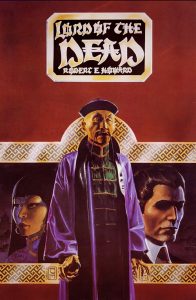 DE: My first book cover was for Donald M. Grant Publishers, back in ’78 or so, doing a jacket and interior illustrations for a hardcover of Lord of the Dead, by Robert E. Howard, the creator of Conan. Lord of the Dead was Howard’s homage to Sax Rohmer’s Fu Manchu books. I was young and inexperienced, and because it was Howard, the first cover I painted was a lousy imitation of Frazetta, with the muscular hero and sexy asian chick, menacing lascars attacking them. A few days before I turned it in, I realized how bad it was. I trashed it, and started from scratch, doing my own thing, not trying to imitate anybody. It was a much better painting.
My first work in comics was inking Phil Foglio’s pencils on a Munden’s Bar story, which was a backup strip in a comic called Grimjack by John Ostrander and Tim Truman. This was back in the early 80s, when I had just moved to New York City. I hadn’t looked at comics since I was a teenager, but my friends kept telling me I should get into them, citing all the exciting things that were happening in comics just then. DC and Marvel had pretty much had a complete lock on the medium up to that point, but following on the success of Wendy Pini’s independent series Elfquest, indie comics was the coming thing. Suddenly, it was okay, even popular, to do something in comics other than superheroes in spandex. First Comics, which published Grimjack, was sort of the Dark Horse of its day, one of the larger and more successful of the indies who challenged the Big Two.
CD: What was your most enjoyable book cover assignment?
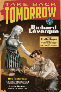
DE: Always the next one. Seriously, recently? One of the more fun ones was Take Back Tomorrow by Richard Levesque. It’s a science fiction tale starring several characters who are in the business of writing and publishing science fiction pulp magazines in the ’40s. Richard wanted a retro look, and I got to delve into old pulp magazines to make sure I got the look right. The design is right in line with the magazines of the period the story takes place in, and the illustration combines two styles popular at the time – the smooth, airbrushed look of the “alien” woman, and the rougher, more painterly rendering on the man. Then when the whole thing was put together, I got to age and fatigue it to look like an old, worn copy of this magazine you might pick up at a flea market or a comics con. Even the back was made to resemble the ads on the back of the pulps. While I was researching it, I was surprised to discover that the backs were almost all printed in one color of ink – red or blue. A scant few used both, but none were full color, as far as I could determine. So I copied that look for the back cover, and then aged that and the spine.
CD: What was your most challenging cover?
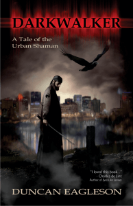 DE: The cover for my own novel, Darkwalker. I was too close to it. I must have started it and scrapped it a half dozen times before I got something I liked. I was my own worst client, micromanaging the thing all to hell.
CD: What’s your favorite genre to create covers for?
DE: That’s like asking “favorite child.” I love all of them. I’ve enjoyed doing Romance, particularly period romance, Mystery, Western, and nonfiction from time to time. But it is true that I keep coming back to the Fantasy, SF, and Horror. Steampunk. Anything in that sort of spec-fic range, really. That’s the sort of stuff I write myself, so naturally I’m predisposed toward it.
CD: In terms of cover designs, what do you look for when you visit a bookstore?
DE: First, something I haven’t seen before. A different approach to the composition or an interesting treatment of the type, an unique illustration style, a stunning photo, used well. Mind you, what I’m looking for is not always what’s going to sell. My years working in advertising proved to me that no matter how much I may love something that’s very new, original, or different, that’s not usually what sells. In fact, the general public may like and appreciate the startlingly new and original thing, but what they’ll part with their hard earned cash for is the thing that feels a little more familiar. They want the new and different, just not all that new and different. Second, I’m looking at the types of things I’ve seen before that I liked, to see if this crop is all bland imitations, or if some of them have something new to say.
CD: What makes or breaks a cover for you?
DE: That’s hard to say, because it can really be any aspect that’s brilliant enough to raise a mediocre cover up, or appallingly bad enough that it can pull a good cover down. I’m an illustrator as well as a graphic designer, so a really good illustration can make a cover pleasing to my eye, even if the type and graphics are less than stellar. By the same token, in a really good original graphic design, especially if the design elements are prominent, a merely passable illustration or photo can scrape by.
Sometimes a cover can be technically good, and still fail. In genre covers, there are certain styles that signify that particular genre. You mostly wouldn’t mistake a Regency romance for a mystery or thriller, even one set in the same period, for instance. These signifiers can include the sorts of type used for the title, the style and content of the illustration or photograph on the cover. But like anything, these signifiers morph and change with time and fashion. The trick for the good designer is to figure out how far you can bend those conventions into something new and original, without losing your core audience. Because you want regular readers of that genre to recognize it as one of “their” books, right away. And sending the wrong signals can sink a book.
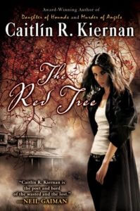 Take Caitlin Kiernan‘s The Red Tree. It’s a tense, psycho/spiritual drama with horror/supernatural aspects and a middle-aged lesbian protagonist (who does not live happily ever after). I don’t know what the art director was smoking that day, but he or she packaged it with all the signifiers of a Paranormal Romance. So Paranormal Romance readers who picked it up were bound to be disappointed, and readers who might be looking for exactly that sort of thing would pass it by. It was arguably a good cover in the sense that it was attractive and technically well done. But in terms of selling the book, it was a horribly bad cover.
So, no there’s not really a single identifiable thing that makes or breaks a cover. It’s all about the individual design, and how it works for the book.
CD: What would be your ideal project?
DE: Probably an illustrated novel. They used to do those for adults, but you don’t see it much any more – somewhere along the line, publishers came to think illustrated novels are kid’s stuff. Though you do see them for adults occasionally now – Brom has done a couple, so has Mike Mignola. Alternatively, another a full graphic novel would be cool.
CD: And, finally, our standard questions from Bernard Pivot’s classic questionaire:
– What is your favorite word?
This week? “Sesquipedalian.” Next week it will probably be “umbriferous” or something. Yes, those are real words, look ’em up.
– What is your least favorite word?
Any word the media or the interwebz have added syllables to to make it sound more important. “Irregardless.” Also “orientate.” It’s “regardless” and “orient,” you pompous buffoons. And you don’t “acclimatize,” you acclimate. Grrr.
– What turns you on creatively, spiritually or emotionally?
The world – nature, science. And well made art of any sort.
– What turns you off?
Intolerance.
– What is your favorite curse word?
Clusterfuck.
– What sound or noise do you love?
A cat’s purr, and percussion music. Not necessarily at the same time, though I’ve heard that, too.
– What sound or noise do you hate?
When you’re doing some work on tech – installing a new hard drive or a video card, or something – and you hear that little clicking tinkle that tells you some tiny piece that you overlooked just fell into the guts of this machine. And it’s probably just a loose screw, but it could be something important that will kill the thing’s operation, so you know you’re now going to have to ferret it out. Yeah. I hate that sound.
– What profession other than your own would you like to attempt?
I’ve tried most of the ones I wanted to. Maybe helicopter pilot – that’s one I haven’t done.
– What profession would you not like to do?
Undercover cop. I did a little of that sort of work for a private firm once, years ago, and would never want to do it again.
– If an afterworld exists, what would you like to hear the deity of your choice say when you arrive there?
“Nice job. Need a break, or are you ready for the next act?”
Find Duncan Eagleson on the web:
Website Art Station Deviant Art Masks Amazon Facebook Google+