The Right Look for Your Book
There are probably a near infinite number of possible ways to design a book cover, but the basic sorts of approaches fortunately boil down to a few. At one end of the spectrum is a purely graphic and type oriented design, at the other a photo or illustration dominates. Most books fall somewhere in between.
Designing a book cover is a juggling act. On the one hand, you want to be original and different, stand out from the crowd. On the other, readers have been conditioned to expect certain types of cover designs to signal certain types of books, and while a surprise might delight some, it will disappoint others, and get your client bad reviews. So it’s wise to to incorporate at least certain genre signifiers, and if possible, give an accurate sense of the flavor of the book.
What follows is my own observational breakdown of some of these basic approaches, and the ways and genres in which they tend to be used. These are very broad categories, and they’re not all separate and distinct, like there’s a virtual Berlin Wall between them, the Graphic getting all maudlin and crying in its beer that it will never see it’s cousin Illustrative again, because he’s trapped on the other side. It’s more like a big party where people of like interest tend to gravitate together, but no one’s telling the air conditioning repair gal she can’t hang with the rock musician – or also be a musician herself. Many covers don’t fit neatly into one or another of these categories.
The examples I’m using below were just grabbed from Amazon, not quite randomly, but more with an eye toward demonstrating a style than finding the most impressive example of that style. I’m not giving these covers awards (though one or two may deserve it), I’m using them to demonstrate a point.
Graphic Looks:
There are books which use nothing but type on the cover, sometimes artfully arranged or unusual type. You see this on self-help books and books by famous names, where someone figured the name alone was enough to sell the book. This is probably not the best choice for most self publishers. Stephen King or J.K. Rowling books would sell if they had nothing on the cover but the author’s name. Maybe you’ll be there too someday, but to get there, you need to sell a serious buttload of books, and unless you’ve already got a huge fan base, a cover with nothing but type probably isn’t going to help that happen.
Mainstream nonfiction often occupies this spare, more graphic territory, mysteries and thrillers sometimes go there. Humorous fiction often gets a graphic treatment, too, though its frequently in the form of cartoon-like illustrations in flat colors, like animation cells or vector illustrations.
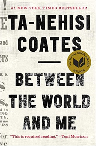


Above: Pure (okay, almost pure) type. Coates and Ellison both have fan bases. Not sure about Kalanithi, but I notice his cover starts to incorporate images with that floating feather. Sometimes type is arranged with other graphic symbols, or small photographic elements. As images begin to become as important as the type, the graphic approach begins to shade into the photographic or illustrative.
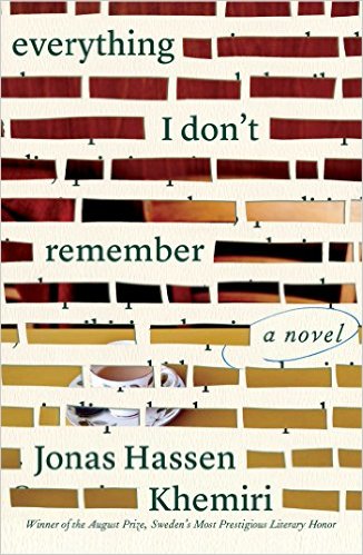
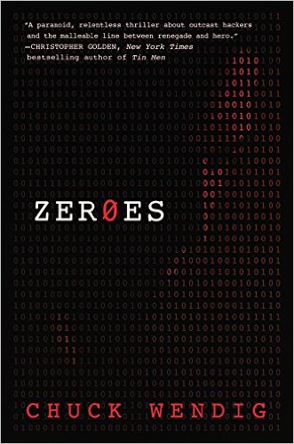
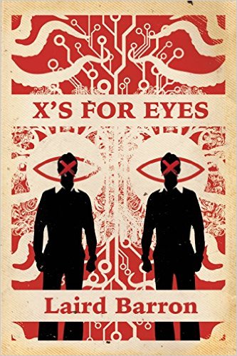
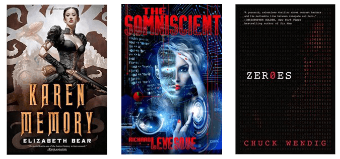
In these three covers, we see photography being integrated with typography. Often, this approach can create a sort of double-take. On Khemiri’s book, you think you’re looking at tape or magic marker blotting out words until you notice those rectangles are actually gaps revealing a photo. The approach on Wendig’s Zeroes does something similar – a photo of a young man’s face is formed out of the ones and zeroes of computer code, and it can take a minute to realize what you’re seeing. X’s for Eyes shows a graphic style that’s been gaining popularity recently, with its elaborate design and flat vector shapes – in this case, adding in high contrast photographs.
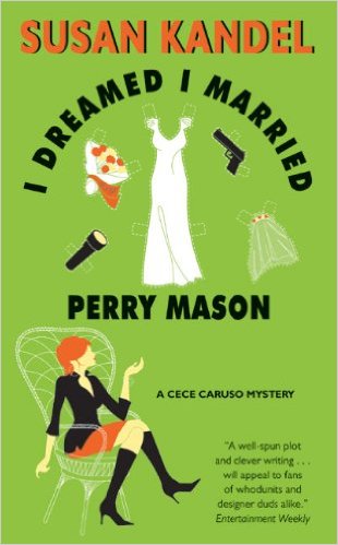
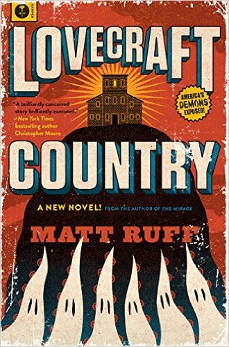
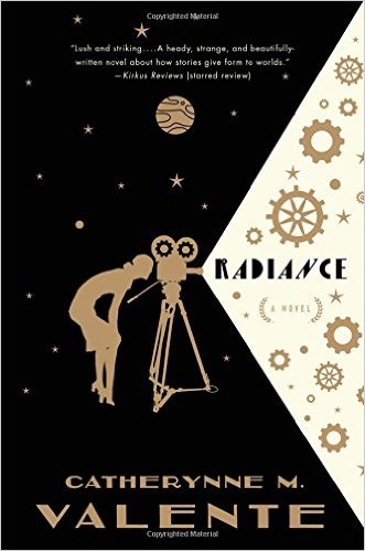
On the lighter side of integrating illustration with graphics, you get the vector cartoon approach that’s been seen on so many light romances (formerly called “chick lit,” which the “chicks” understandably found demeaning, so now they call it “women’s lit,” I think…) and on humorous paranormals. This look is demonstrated in Kandel’s I Dreamed I Married Perry Mason, above left. Ruff’s Lovecraft Country is also cartoony – though it gives us a sense that it might be a tiny bit more serious while still keeping it’s tongue in its cheek (or someone’s tongue anyway – it’s a Lovecraftian tale, after all). With Valente’s book, we see how the graphic vector look can also serve a somewhat more serious subject.
Photographic:
Thanks to the proliferation of stock photo houses and free public domain photo databases on the web, it seems as if photographic covers appear now in every genre. More and more artists these days are doing photo-manipulations, combining various pictures in Photoshop to create a single image. This can be a matter of a subtle retouch, a completely collaged scene, or anything in between. The more manipulating the artist does, the closer it gets, I think, to illustration. Lots of non-fiction and mainstream fiction use photographic looks. Romance, and paranormal romance, seem to favor photos and photo-manipulations, as do a certain number of steampunk novels.
Photographic covers. Black and white photos often seem to carry a greater sense of weight and seriousness, probably because historically, B&W photos have been associated with newspapers and serious journalism (What? There’s such a thing as serious journalism? Not any more. Don’t get me started on that.) Where was I? Oh, photos, right. So while you’ll see B&W photos on fiction now and then, they’re most often used on nonfiction. Color photos, by contrast, seem to promise something less serious and more fun – an upbeat nonfiction tale or a rousing adventure novel.
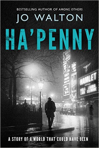
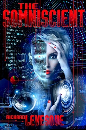
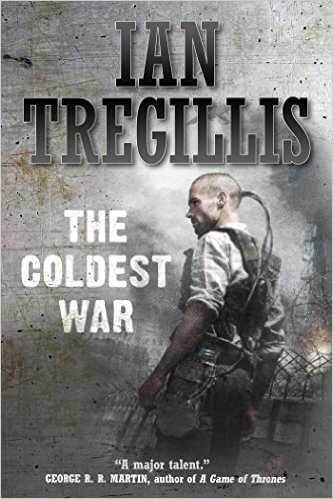
Photomanipulations can range from the subtlest retouch to the most elaborate collage. On the cover of Jo Walton’s Ha’penny, for instance, a period photograph has been used with (as far as I can tell) only the minor retouch of placing “Hamlet” and a couple of the character’s names on the theatre marquee. My cover for Levesque’s The Somniscient utilizes five different photos and a number of vector graphics. With works like The Coldest War, we’re shading into illustration as the artist takes a photo-collage and starts painting over it to give it that hand-illustrated look.
Illustration:
Complex photomanipulations and original paintings tend to be somewhat more expensive than stock photos, because they’re much more labor intensive. However, they do give a more unique look to your book. Stock photos are licensed over and over to many clients, so you might see the stock photo from your cover on another book. With illustrations, photos, or photomanips created custom for your book, you’re usually buying an exclusive book cover license, so that won’t happen. Custom illustration turns up sometimes on mysteries and westerns, but its real redoubt is in science fiction and fantasy.

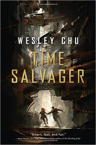

Illustration can range from the highly detailed, almost photographic work of someone like Dan Dos Santos, who did the covers for most of Patricia Briggs’ books, to the very painterly work of Richard Anderson on Chu’s Time Salvager. Somewhere in between are artists like Cynthia Sheppard, whose cover for Karen Memory walks the line between painterly and realistic, with a touch of the graphic thrown in for good measure.
On Tone
As David Farland has observed, regardless of how marketing people categorize genre, readers buy books based not so much on genre, per se, as on feeling and emotional tone. It’s true that certain genres do tend to evoke certain specific emotions – fantasy novels evoke feelings of wonder, horror novels dread and fear, romance novels the rapture of falling in love. But there are lots of shades of emotion. The secondary emotional tone of a book has as profound an effect on a reader’s enjoyment as the primary one. Is the story idealistic and hopeful? Dark and cynical? Nostalgic? Is your protagonist just coming of age, finding their identity? An experienced pro in their field? A world-weary cynic? When creating a cover for the book that will speak to the readers who will most enjoy that particular story, getting the tone right may be even more important than any signifiers of genre you could come up with.
I said at the outset that the correlations I’ve made here between types of cover approaches and genres are purely my own observations, and not based on any scientific survey. Nor are they in any sense rules – no one has a gun to your head telling you “Use an illustration on your SF book, sucker, or else.” But the reality is that you (and your readers) will be best served by making sure that whatever else the cover does, it accurately reflects the emotional tone of your book.