20 Questions: Richard Levesque
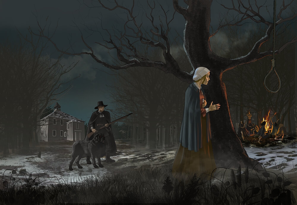
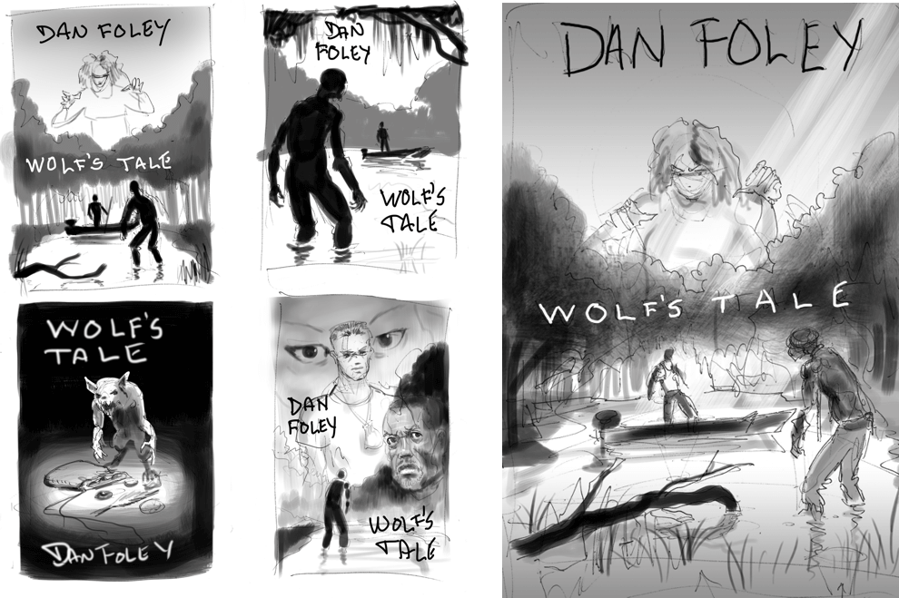
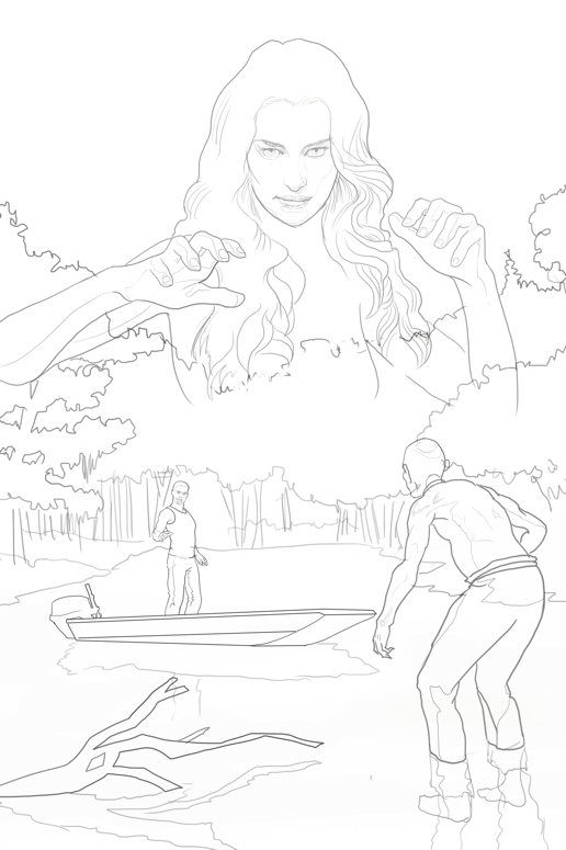
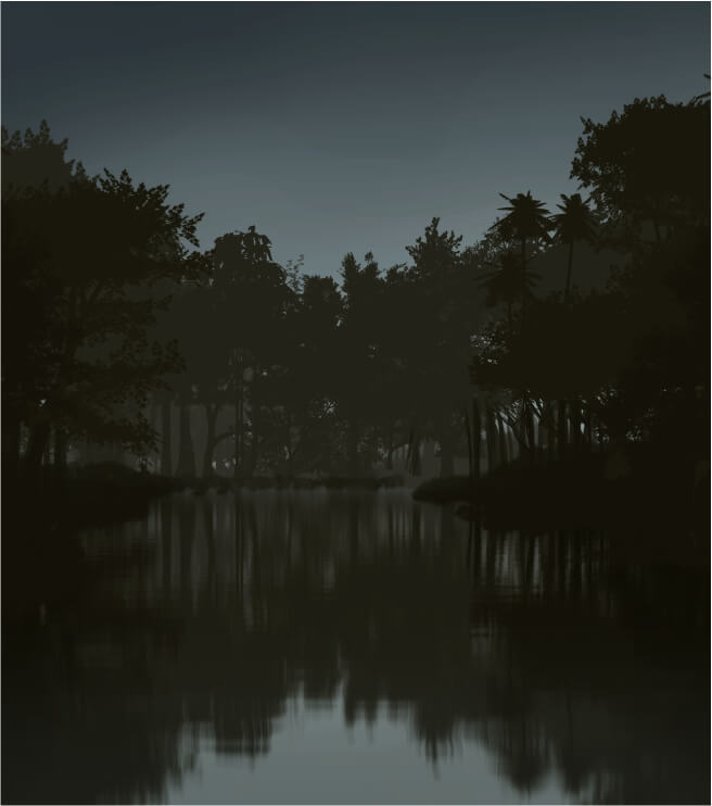
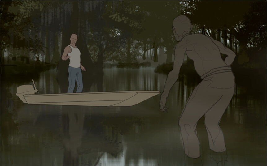
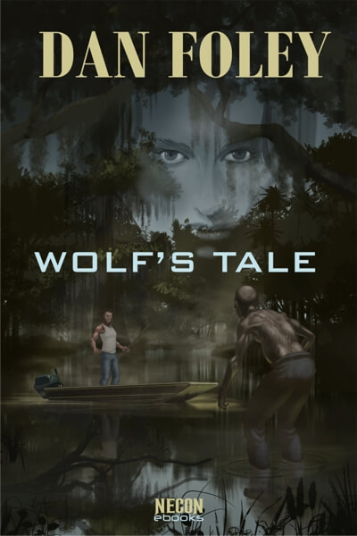
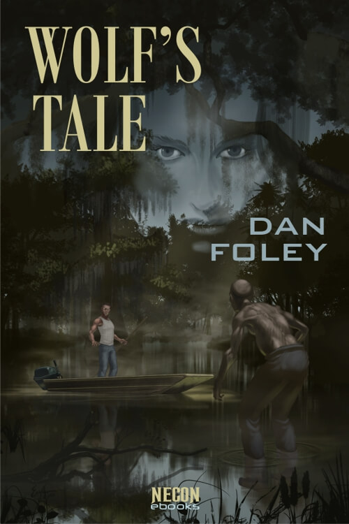
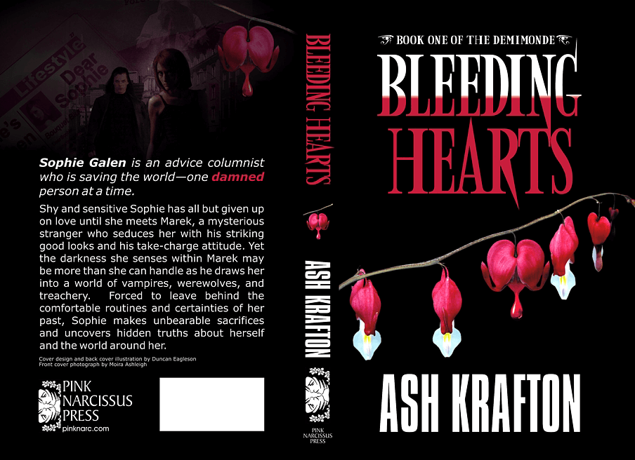
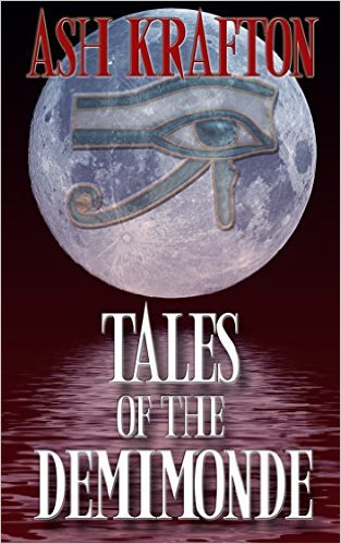
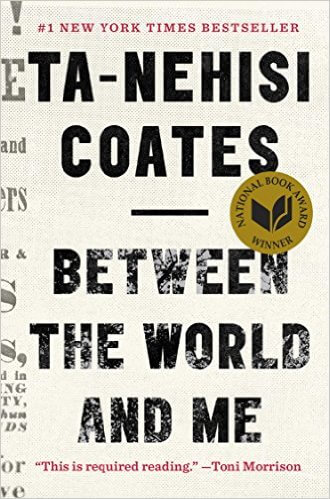
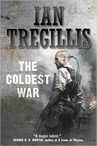
 I first encountered Richard Levesque when my friend Steven Jay Cohen, who narrates audio books, mentioned a client of his was looking for a cover designer. Richard Levesque was reissuing Take Back Tomorrow, and wanted a new cover for it. As I always prefer to do, I read the book before beginning the cover, and was immediately captivated by Richard’s tale of 1940s pulp science fiction writer who gets caught up in a real-life science fiction story. Making the cover resemble an actual pulp magazine seemed like a no-brainer, and Richard seemed quite happy with it.
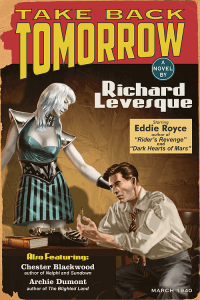 Take Back Tomorrow was good enough that I’d have sought out Richard’s other works even if he hadn’t continued to commission covers for them. I’m a sucker for noir, and Richard handles noir as skillfully as anyone, whether it’s in a classic 40s setting, or future noir settings reminiscent of William Gibson or Phillip K. Dick.
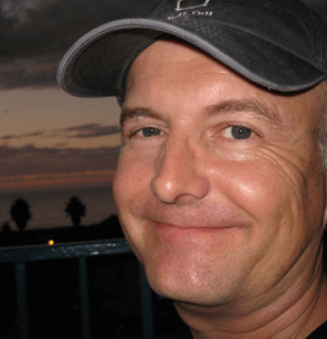
According to his bio, Richard Levesque has spent most of his life in Southern California. For the last several years he has taught composition and literature, including science fiction, as part of the English Department at Fullerton College. His first book, Take Back Tomorrow, was published in 2012, and he has followed it with other science fiction and urban fantasy novels, novellas, and short stories. When not writing or grading papers, he works on his collection of old science fiction pulps and spends time with his wife and daughter.
Richard graciously took time out of his busy schedule recently to answer a few questions for our blog.
Corvid Design: I think most people who have read your work would agree that it’s on a par with most of what the big New York publishers put out, and better than many. Did you try shopping your work to agents, or to the few big companies who still accept unagented submissions? Or did you intend to self publish from the start?
Richard Levesque: First of all, thank you for the compliment. I did start out shopping Take Back Tomorrow to agents and then a different (more science fiction, less paranormal) version of The Devil You Know. I was lucky enough to find an agent who believed in me after about a year of trying and she shopped both of those books to publishers big and small. Many praised the books but the answer was always “just not right for us” and so they passed. Around the same time, my agent decided that she was stronger in the non-fiction market and we parted ways. I independently published Take Back Tomorrow about four months later, realizing that the publishers were all looking (at the time) for the next Twilight or its equivalent, which wasn’t something I had written, nor did I plan to write.
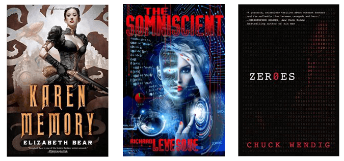
CD: Your most recent book, The Somniscient, is gathering a lot of praise these days. It’s been compared to early William Gibson or Neil Stephenson. It seems strange to hear a reviewer refer to “some good old-fashioned cyberpunk,” but it is true that cyberpunk has now been around for more than 30 years. Today we’ve got steampunk, and deiselpunk, and all sorts of other “punks,” and from the nature of the stories they tend to tell, it seems like most have forgotten the subversive aspects the suffix “punk” was intended to convey. Does The Somniscient have a subversive element? Thirty years later, can cyberpunk even be subversive?
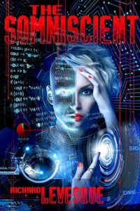 RL: The Somniscient has dystopian elements that, if you think about them, mirror some things going on today with technology and corporate culture. And there are people within the story hoping to bring down the power structure; one of the main characters gets pulled into that fight through no will of is own, but once he’s in it, he has no choice but to finish it. So, yes, I’d say that’s a bit subversive. It’s not the “high tech and low lifes” that we find in early Gibson, but there’s a bit of that. It’s the early cyberpunk that really appeals to me, which was why I set it up this way. And I would definitely say that cyberpunk still can be subversive; part of the reason that’s slipped away may be that so many of us have become seduced by the technology, even the punks.
CD: What set you off on telling this particular story? What was the idea that made you think “Yeah, I could build a whole novel around that.” And was it necessarily cyberpunk from the get-go?
RL: There were a few kernels. One was a bout of insomnia that I went through a couple of years ago and the thought (it probably occurred to me in the middle of the night) of being paid in sleep rather than currency. Another was an offhand comment my wife made to my daughter–“In the future, no one will have time to watch movies. They’ll just download the memory having watched them.” That struck me as brilliant, and that little piece of the future gets tossed into Chapter One, just a bit of the atmosphere that’s created. Knowing that the only way those two things could happen–the commonplace downloading of things into our brains and not being allowed to sleep until it’s earned–would be if people had chips in their brains, going the cyberpunk route seemed like a natural fit.
CD: Several of your tales take place in the 1940s, which is clearly a period you have great affection for, and have researched thoroughly. Tim Powers has talked in several interviews about how for him, research comes first, and that a certain point these interesting questions come up, and as he looks further, a story starts to practically tell itself. Do you research first? Or do you come up with a plot or a rough story idea, and then do the research to support it? If you plot first and then research, does research ever inspire or convince you to change your plans in major ways?
RL: I would have to say it’s plot first. I mean, I’ve done a lot of research into that period in the first place having focused on Hollywood writers of the 20s-40s while working on my Ph.D. dissertation. So I had a lot of background and a real affection for the period before I started setting plots in that time frame. Now that I’m grounded there, though, when a plot idea comes to me and seems like a good fit to set it in that era, I just do minimal research to flesh things out. I had to look up a few things about currency and whether certain historic buildings were or weren’t there during the time I’ve set the plot.
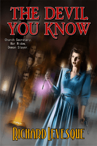
For Foundlings, I had to do a lot more research. I had a basic understanding of what happened to Japanese Americans during World War II, and I knew that the old California State Hospital for the mentally ill had been converted into a university, but I didn’t know anything about the Japanese settlement in Los Angeles that was razed after Pearl Harbor or the specifics of the hospital/campus. There was a lot I had to look into to make that book read as accurate, and I think it came out nicely. The things I discovered while researching that book definitely changed the plot, but I’m not sure that’s happened so profoundly with my other books.
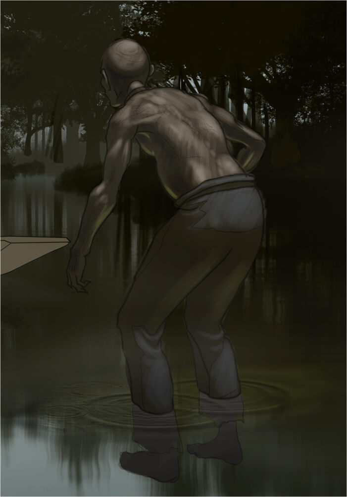
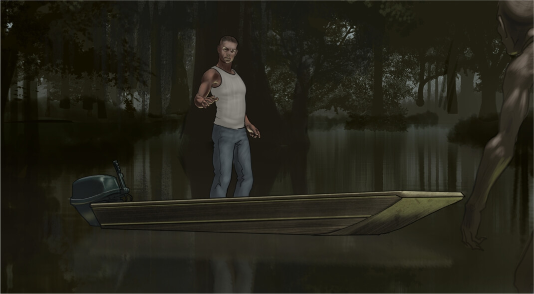
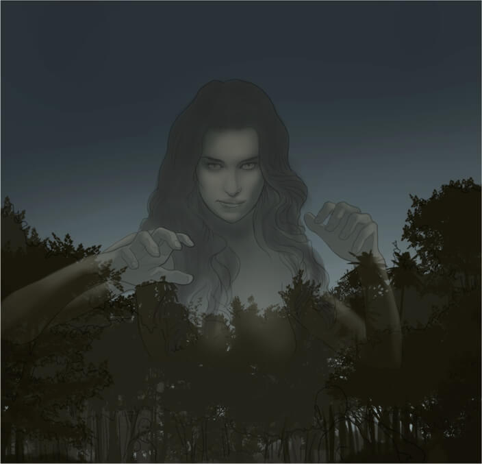
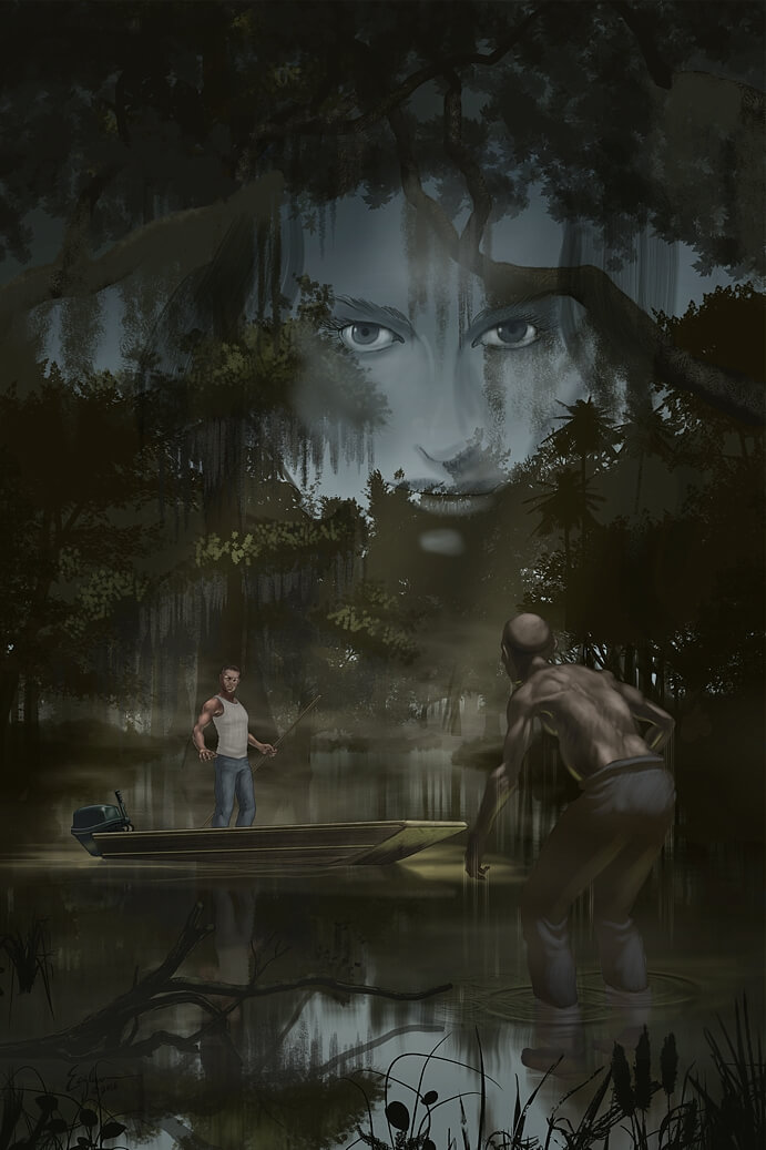
CD: Aside from the obvious case of demons impersonating movie stars, are any of the characters in your period pieces based on actual people? The publisher in Take Back Tomorrow, for instance, or the rich boy’s deceased father in Devil You Know?
 RL: Those characters are just types, not based on anyone specific. There were elements of Chester Blackwood’s past (one of the characters in Take Back Tomorrow) that I lifted from my earlier research on Hollywood writers in the 1920s. One of my favorites was a guy named Don Ryan whose 1927 novel Angel’s Flight has a protagonist whose background has elements similar to Blackwood’s, and Ryan’s early career as a Los Angeles journalist also worked its way into Blackwood’s backstory; the hero of Angel’s Flight is named Will Pence, and I used that name for one of the characters in Take Back Tomorrow as a bit of homage to Ryan, whose work is largely forgotten.
CD: Tell us a little about your process. Do you outline? Use character sheets?
RL: I get an idea and I let it sit. If it won’t leave me alone, keeps coming back into my mind for months on end, I decide to let that one come to the head of the class. Because of the schedule with my day job (college professor) there are huge blocks out of the year when I can’t write fiction and huge blocks where I can. I also have a commute that’s roughly one hour each way. So when I’m getting close to having time off, I shut the radio off in the car and spend my 2 hours a day in the car working through the plot. It gets kind of obsessive. There are usually one or two things that I can’t quite figure out, so the plotting and planning works its way into the rest of my day for those few weeks. Then I get it and as soon as the last grade is submitted, I start writing.
I don’t do a formal outline but usually have the whole thing plotted out in my head. I write a thousand words a day until the first draft is done. Then I go back through and do a first read-through, plugging holes as I go, adding in things that only occurred to me as part of the process. Then I send it off to beta readers and wait for feedback before I jump back in and start revising.
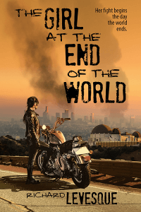 CD: I don’t recall where I read this, so it could be an interwebz factoid, but I recall reading that China Mieville had an ambition to write one book in each major F&SF subgenre. And he certainly seems off to a good start, whether that plan is conscious or not. You also have written in a variety of these subgenres – future noir, period SF, historical supernatural thriller, cyberpunk, post-apocalyptic… Have you considered doing sequels, or creating a series, or are you more like Mieville, wanting to do something new and different each time?
RL: This is where I must confess to the lousy nature of my marketing plan. When I was writing to try to win over agents, I wrote books that I thought would be appealing with no thought to establishing myself as a writer of this or that kind of book. I was just casting my line and hoping for nibbles.
When I moved on to indie publishing, I stuck to the same plan (which was to not plan). Because I’d already written a noir time travel story, a future noir cyberpunk mystery, and a noirish paranormal fantasy, my first publications didn’t have a clear niche.
I proceeded to write things I found interesting–more paranormal noir, a YA post-apocalypse, a literary-historical mystery, and then back to cyberpunk.
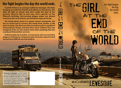
I have had a blast following my muse, but I think I may have hurt myself from a marketing standpoint as readers who love Strictly Analog don’t necessary want to follow me to The Girl at the End of the World or Foundlings.
My plan for now is to stop jumping around and stick to science fiction. The next one will probably be set in the 1920s, and I have an idea for a dieselpunk series that I might launch into later in the year.
CD: When you’re writing in a particular genre, do you read within that genre while you’re writing? Or do you avoid that, and read something else entirely?
RL: I tend to avoid it. I don’t want any undue influence.
CD: William Gibson has said that when he wrote his seminal cyberpunk novel, Neuromancer, he didn’t even own a computer, and typed the manuscript on an IBM selectric. In Strictly Analog, your hero, Ted Lomax, as the title suggests, is an analog guy in a wired and uplinked world. As a private eye, he exploits the peculiar advantages of being unplugged as he is. Though you’re clearly comfortable moving in the digital world now, you’re also old enough to remember a strictly analog world. Was Ted Lomax you at some point? Were you a late adopter of this technology?
RL: I did use a typewriter when I started writing, but that’s only because the idea of personal computer was still a ways off. The first story I really felt good about was typed on a 1923 Underwood in a Los Angeles apartment I lived in that was the model for Eddie Royce’s building in Take Back Tomorrow.
I was always kind of a lousy (self-taught) typist, so when I figured out that I could write something on a word processor and fix my mistakes without having to re-type the whole damned thing, I jumped into using a computer (around 1990) and never looked back.
CD: You’re also a teacher… have your students, or your interactions with students, influenced your writing? How?
RL: I’m sure it has, but it’s hard to say how. I’m a firm believer in the idea that the best way to learn something is to teach it to someone else. Keep in mind that I don’t teach creative writing–usually college writing and developmental writing. However, by explaining the writing process and the editing process to others, it has given me a pretty good handle on how best to incorporate those processes into my own work.
CD: To wrap up, we’re going to steal an idea from Inside the Actor’s Studio (who in turn stole it from the French TV series, Bouillon de Culture, so we don’t feel too bad about that), and pose the famous ten questions from Bernard Pivot:
– What is your favorite word?
Quagmire
– What is your least favorite word?
Pessimism
– What turns you on creatively, spiritually or emotionally?
Free time
– What turns you off?
Bigotry
– What is your favorite curse word?
Kind of boring, but I’d have to go with “goddammit” since that’s usually the first one out of my mouth.
– What sound or noise do you love?
Laughter
– What sound or noise do you hate?
Barking dogs (but only in the middle of the night)
– What profession other than your own would you like to attempt?
Disc jockey
– What profession would you not like to do?
Funeral director
– If an afterworld exists, what would you like to hear the deity of your choice say when you arrive there?
That I found my happiness without causing anyone else to suffer and that I did all I could to help others find their happiness, too.
Thanks, Richard, we appreciate your taking the time to do this.
Find Richard Levesque on the web:


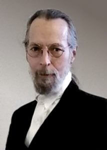 The managing partner, that is myself Moira Ashleigh, often has a say in questions for the interviews on Corvid design, but the art director usually leads the interviews. This time the questions came only from the managing partner to the art director, Duncan Eagleson.
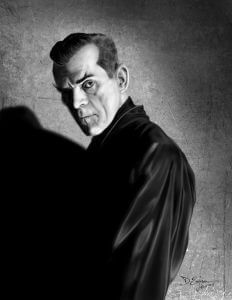 I learned about it late – it was halfway through this October when I stumbled across Inktober pieces by a couple of artists I know. I’d been thinking for a while I needed to do something along these lines to help hone my skills, particularly my digital painting skills. The last time I did something like this, it was a painting a day for a month, and I gessoed over the painting the following day to begin a new one. It was a process that lead to major advances in my skills. So, looking at the Inktober thing, I adapted it to my own purposes, and sort of met it half way by doing black and white paintings in Photoshop. My schedule was such that I didn’t have time for one a day, but I managed one every other day for the latter half of the month. To add to the challenge, I set myself a couple of other rules: minimal layers, no adjustments (like brightness, contrast, etc), and no selections or masks – everything done by hand. When you’ve gotten used to using layer masks, going back to using the eraser again is a little like losing the “undo” option.
 DE: Definitely both. You’re not having to think about color, just composition and tone, contrast. Of course, in several cases, I just went with the original Hollywood photographer’s composition, those still photographers of the day really knew what they were doing. So they’re really just studies in values, in using pure value to make a visual statement. The mass of Karloff’s shadow and black silk shirt, or the way the light source works from Evelyn Ankers’ candle (it looks all right at first glance, but look close, you’ll see evidence the effect is a photographer’s lighting trick – I specifically did not correct that, but rendered it as it was).
 DE: I don’t know that I have a favorite form, but I guess if you put a gun to my head and forced me to pick, I’d have to say painting, whether digital or traditional. But even the visual arts are not just about the visual for me. My art is about telling stories with words and images, whether it’s a comics story, a book cover, a movie poster or DVD cover. Those covers tell a story as well, they’re telling a story about what’s inside. There was a time, back in the early eighties, when I took some of my paintings around to New York galleries, and they all turned up their noses at it, usually sneering something about “narrative art” and “representationalism.” One fellow actually said “This isn’t ‘Art,’ it’s merely illustration.” Well, duh… yes, it is, and I’m not embarrassed by that, I’m proud of it. I don’t accept the assertion, which was common in those days, that illustration cannot, by definition, be “art” with a capital “A.” That’s nonsense. Storytelling is one of the most basic and essential of human activities, and informs all types of art, high and low, whether the artist intends a “narrative” or not.
 DE: My first book cover was for Donald M. Grant Publishers, back in ’78 or so, doing a jacket and interior illustrations for a hardcover of
  DE: The cover for my own novel,
 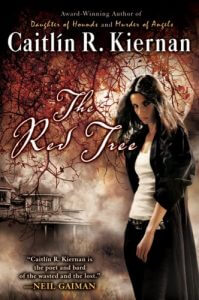 Take
Take